
It's that time of the week again... Tuesday! Thanks to The Broke and the Bookish blog, there is another fun and exciting Top Ten Tuesday list to create. This week's theme was bad book covers. I place great importance on book covers because they are how I decide what to read - a boring cover means that it will continue to collect dust on the shelf. I took this Top Ten Tuesday as an opportunity to throw in a bit of my own Cover Snark, inspired by A Reader of Fictions blog. Below are ten books from my personal bookcase whose covers disappointed me. Click on the title of a book for a link to Amazon Books for more information.
 1. The Goddess Test, by Aimee Carter
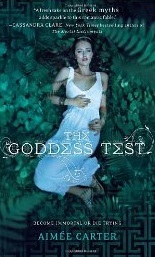
Girl, sleeping in the forest is generally looked down upon by society. Plus, you're going to get poison ivy, hypothermia, or get eaten by a bear. AND, your white dress will be stained by dirt. What a tragedy!
Quick fix - pose standing up. It's an easy way to avoid many of the dangers of the forest, and it is much more realistic.
 2. Uglies, by Scott Westerfeld
To start off, this book is about people who are ugly. And that girl is clearly not ugly. Also, what exactly is she standing next to? Is that a plant? It looks too tropical for the Northern forest setting of the novel.
Quick fix - make the subject something other than a person in order to avoid the whole ugly versus pretty dilemma on the cover.

Moth. Ew. Well, this book really has nothing to do with moths at all, so I guess it just represents faeries. This cover does not represent how much drama there is in the book. Plus, the color scheme is too monotoned.
Quick fix - nix the moth. Stick to a faerie illustration because it shows a whole lot more about the topic of the book.

Seriously, what is with moth covers? Cover designers for some reason got the false impression that it is acceptable to portray faeries as moths. Well, it's not.
Quick fix - NO MORE MOTHS!

It's quite ironic that this book is about a Fae princess who is obsessed with beauty, yet the cover is so ugly. That hair and dress look like Rapunzel got attacked by pearls. Plus, all of the floating heads in the background cheapen the image.
Quick fix - remove the floating heads and beautify the princess.
 6. No Such Thing As Dragons, by Philip Reeve
Judging by this book cover, there is a such thing as dragons. And they need some manicures ASAP. However, I do like the contrast between the dragon's foot and the snowy mountains.
Quick fix - make the dragon's fingernails a different color, preferably a shade of cream or white.

7. Plan B, by Jenny O'Connell
Peek-a-boo, I see you! One would think that MTV would be a little more creative with their book covers. Give this cover some more glitz and glam. After all, it's about a Hollywood bad boy superstar.
Quick fix - add more Hollywood. Maybe include some bright lights, sparkles, or color.
 8. Chasing Vermeer, by Blue Balliett
Both of those two kids are having the worst hair days of their lives. Also, that coat... Those characters do not look like the type to be solving important mysteries.
Quick fix - modernize the hair and outfits. Making the trench into a navy pea coat would instantly bring the image back to the twenty-first century.
 9. Whistling for the Elephants, by Sandi Toksvic
Haha, I just noticed that the parrot is hanging onto the "C" with it's beak. But why do we see only half of an alligator/crocodile?
Quick fix - show the entire croc and add a couple of other animals.

This reminds me of that poppy field from the Wizard of Oz that puts everybody to sleep (including the dragon, who is catching some shut eye on the title).
Quick fix - make the image background more defined to avoid haziness.
I hope you enjoyed this Top Ten Tuesday. Please comment with your perspective on my book cover critiques and link your own TTT lists so I can check them out!
Read on,

I completely agree with you about Uglies. Not a great cover!
ReplyDeleteBookcovers are important to me too, they always say don't judge by its cover but I think that in the end we all do it.
ReplyDeleteI also nominated you for the Liebster Award. For more information check out my blog.
El @ So Bookalicious
I haven't read any of the books you listed, but I definitely agree about the covers. Those covers could use serious makeovers.
ReplyDeleteThat girl on the Uglies cover definitely isn't ugly. I feel like they can't have a live person on that cover. And oh my god, I've never heard of Plan B, but that is a terrible cover and it also sounds like a book about someone who doesn't want to get pregnant.
ReplyDeleteYeah I think all the Goddess books by Aimee Carter need a redesign they just don't work.
ReplyDeleteJaime @ Two Chicks On Books
Plan B's cover makes it look like a poorly thought out health pamphlet you'd find in a waiting room. I like that you provided some improvement suggestions for the covers.
ReplyDeleteI like your little suggestions!! Cute idea :) I just saw a cover of Uglies on someone elses blog that mustve been from the UK or something. It was a bedpan full of Barbie legs and arms. Super disturbing, so compared to that, I'll take the blah-ness of this one :) Is Plan B about getting pregnant? It looks like she's scared to look at the pregnancy test or something. Terrible!
ReplyDeleteThanks for stopping by My TTT
I totally forgot about Plan B. I think you're right the cover doesn't demand attention. I expect more from MTV.
ReplyDeleteThanks for stopping by!
Aly @ My Heart Hearts Books
Oh the Uglies series... I just don't understand any of the choices made for these covers!
ReplyDeleteThat Plan B cover is also incredibly bland. Ick!
Oh, my, you've compiled quite a collection of unattractive covers! Perhaps on The Uglies cover, the hidden side of her face is hideous? :)
ReplyDeleteStephanie @ Inspiring Insomnia